Everyone compares. If you’ve got a product you’re happy with, you’ll compare it with others to see if they offer more. If you’re after a new product, you’ll compare all that are on the market. And if you hate your product, you’ll definitely be comparing the other offerings to find one that suits you better. Like we said, everyone compares.
This can be a good thing though. If you stand behind your product and know it’s the best on the market, then comparison gives you the chance to prove this, you’ve just got to clearly show how it beats all the others. Enter a kick-ass comparison page.
Here’s how to do it.
Competitor comparison
To get potential customers in the door, you first have to show them you’re better than all the competition. There are many ways you can do this - are you cheaper? More flexible? Do you offer more variety of features? Nail down the areas your product is comparably better than the others - this is your focal point.
Step 1: Easy access
Make your comparison page easy to find. If it’s hidden in the back of a complex webpage, customers might think you’ve got something to hide. If it’s front and center it’ll draw their attention to everything they’re going to love about your product that the competition doesn’t offer.
Step 2: Compare yourself
Work out who you want to compare yourself to, or who the market is comparing you to. If you have one major competitor, it’s important to include them so you can clearly show why your product is superior. Equally, make sure you include comparisons to any competitors who don’t offer as many or as high-quality products as you do - this’ll highlight how you stand out. All’s fair in love and war.
Top tip: Google is your friend. Type your company name into the search bar with ‘vrs’ after it, and let autosuggest do the work for you. This way, you’ll know specifically who you’re being compared to.
Step 3: Build it
Work out a list of factors on which you can differentiate your product. Do you want to focus on the features you offer that they do not? Do you want to focus on your price point? Or maybe you offer brilliant benefits that the competition does not. Whichever way you choose to go, just make sure you address the pain points you solve that your competitor doesn’t.
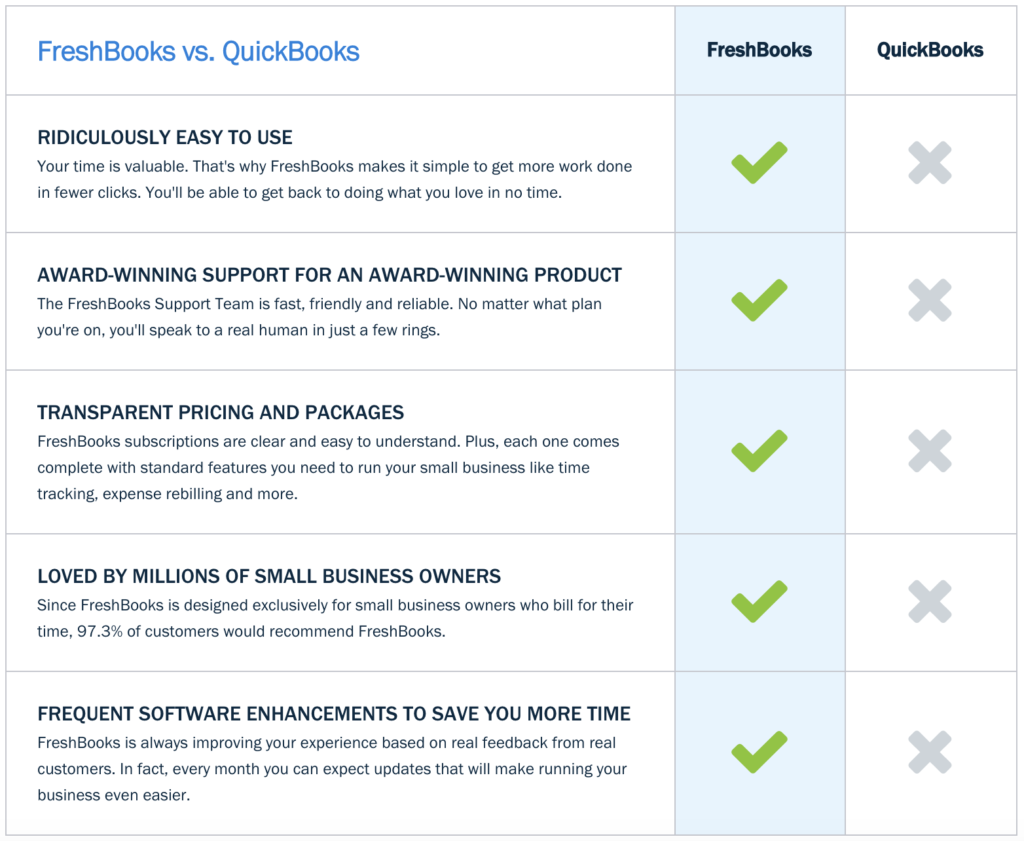
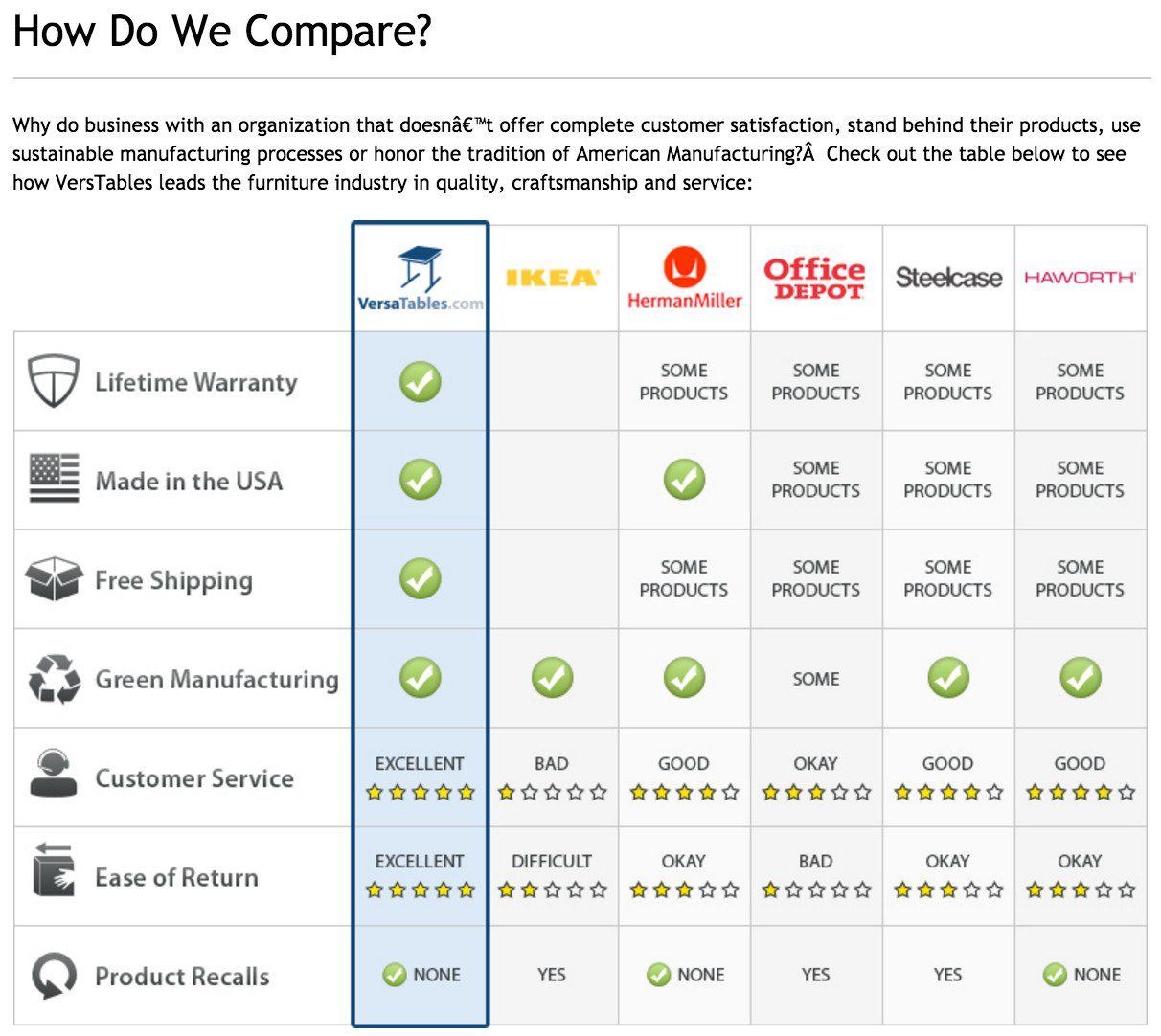
Depending on the amount of competitors you want to address and the number of features you want to pinpoint, you can either create one page for each competitor, or for a more streamlined quick-glance approach, you can create a feature-led chart that includes all competitors at once. Which way you choose will depend on your product, the features it offers, and the size of the market. Here’s an example of both:
To logo or not to logo.
There’s some contention in the comparison page debate about whether or not best practice is to include competitor logos or not. On the one hand, you don’t want to advertise their brand even a little, and logo inclusion does just that, but also, it’s not really good manners to alter or remove a logo. You can see by the image above, the benefits of logo use are a colorfully pleasing page and visual association of your brand with the biggest on the market, but here’s an example of logo removal:
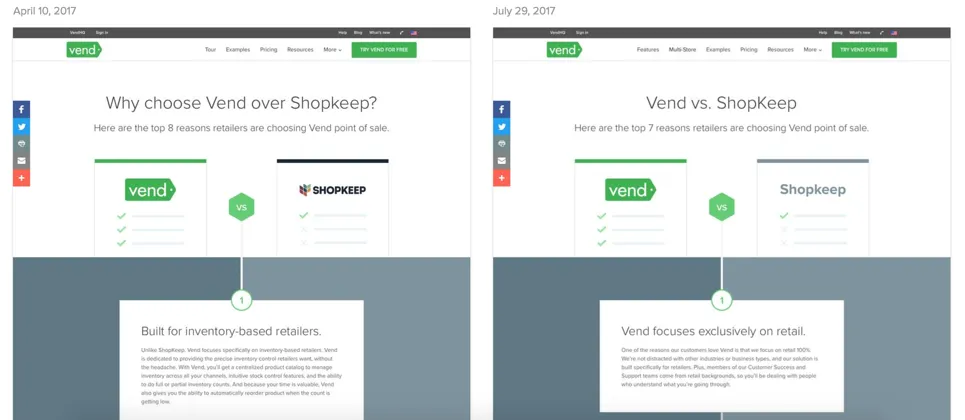
Here, the Shopkeep logo has been replaced with just the company name. This removes any of their branding and gives your competitors the least advertising on your site. It really boils down to what you feel comfortable with and what your branding dictates.
Top tip: Include a date on your comparison chart - you’re updating your offerings regularly and so are your competitors.
Step 4: It’s all about trust
Next, you need to build trust with your product comparison. This is especially important if you’re new to the market or less well known than your competitors. All information must be 100% accurate, and make sure to include good reviews and credible affiliations.

Also, make sure to include any awards, nominations, Oscars or Golden Globes your product has received, including the award logo.

Top tip: Make sure you don’t cross any legal or trademark laws in your comparison table.
Step 5: Tell ‘em what to do
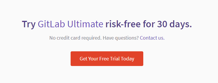
The final part of your comparison page needs to be a snappy call to action. What do you ideally want your potential customer to do next? Order here? Request a demo? Make a booking? Or sign up for a free trial? An easy-click button is the best and most visible way to highlight your CTA, and make sure to include it several times throughout the page. Here are some examples:

In-house product comparison
Remember, customers don’t just want to compare your product to others; they want to compare the products you offer with each other. Creating a page that shows customers in a blink exactly what you’ve got and how they compare creates clarity for potential customers, and is a great way to show those customers already using your cheaper products what they’re missing out on. Creating a simple, one-page document is a very efficient way to present this kind of information.
So, list all the features offered by your products or services and show an overview of the similarities and differences between them. It’s important to have firm differentiation points for comparison and it’s just as crucial to know what features your customers are most interested in. What will be the deciding factor for them? Find out, and highlight them.
A chart is a clear and concise way to do this. It gives all the information in one glance and doesn’t require viewers to flip between pages or even scroll up or down. Here are two great examples of this; one from Baseline and one from Fitbit:
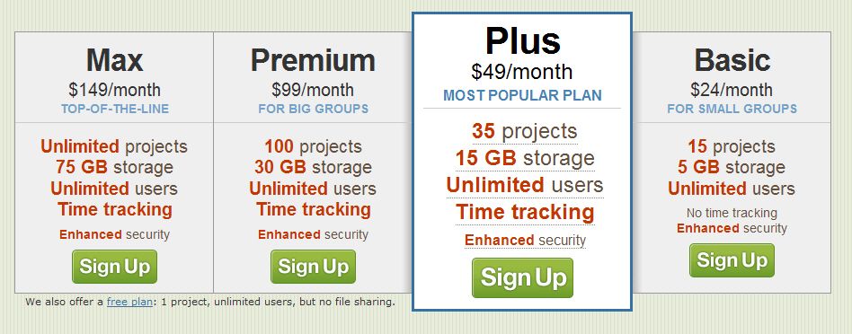
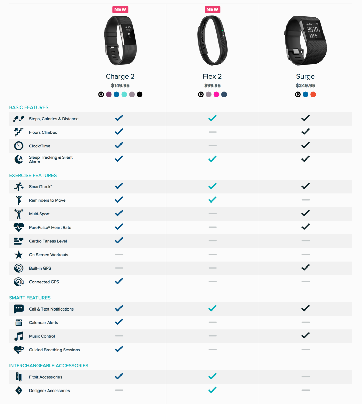
Top tip: Recent research suggests charts featuring the most premium products first are more successful at selling them (as in the Baseline example), as opposed to the basic options.
Finally, remember that comparisons are a good thing. You can use your product comparison pages to highlight why your product is superior, and if it isn’t, then you can use them yourself to clearly see what product areas you need to focus on.


Sales enablement insider
Thank you for subscribing
Level up your sales enablement career & network with sales enablement experts
An email has been successfully sent to confirm your subscription.
 Follow us on LinkedIn


.svg)